Nokia Changes Its Iconic Logo For First Time In 60 Years; Here Are Some Interesting Turning Points In Company's History

Nokia has announced to change its iconic blue colour logo for the first time in 60 years to revamp brand identity and comply with the company's plan to reorient the business strategies. 

Zee Media Bureau | Feb 27, 2023, 13:13 PM IST
1/7

Nokia Changes Its Iconic Logo
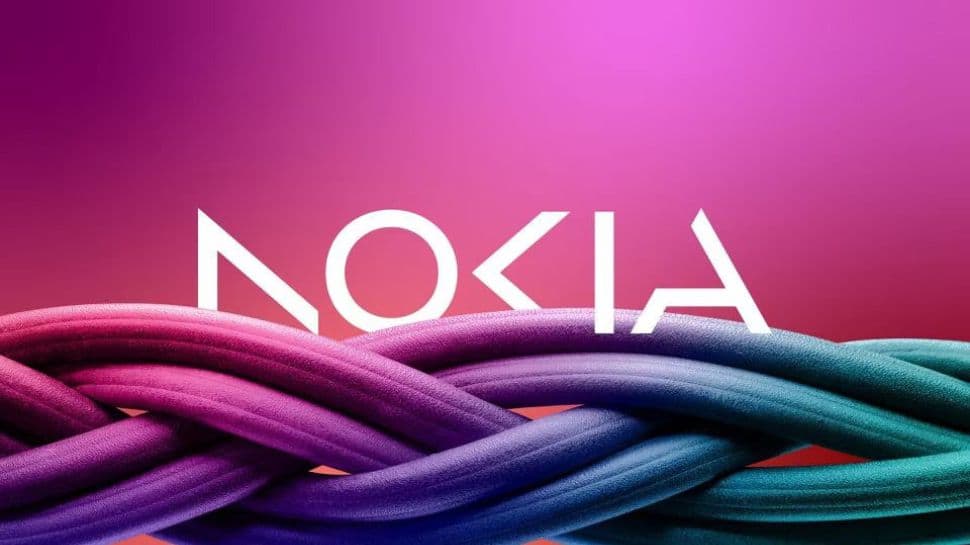
Nokia Changes Its Iconic Logo

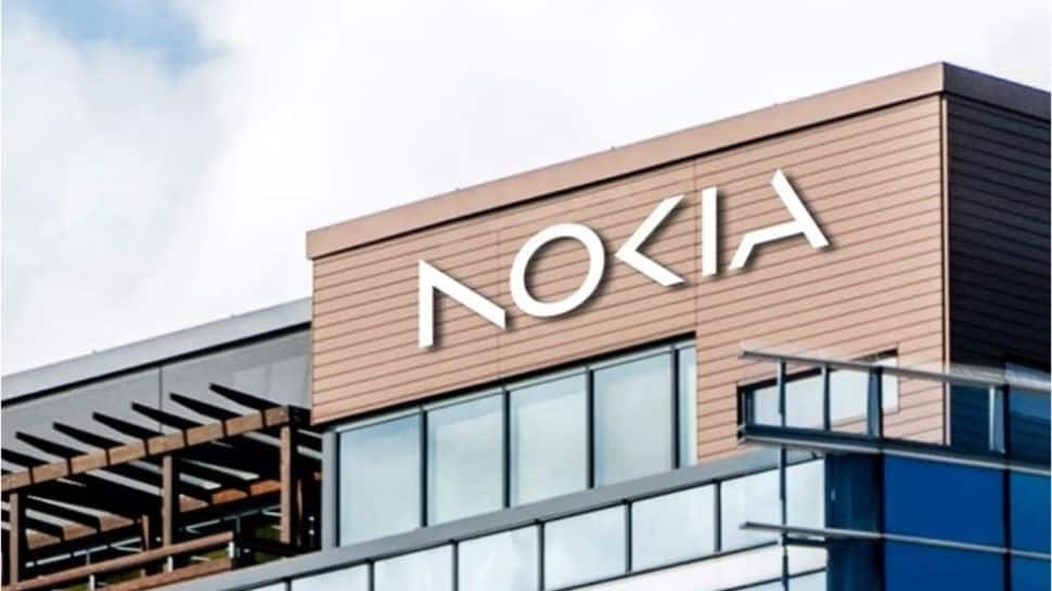
Nokia has changed its iconic logo after nearly 60 years to revamp its brand identity for the first time in the company’s history.

2/7

The Significance of New Logo

The Significance of New Logo

The new logo is made up of five different shapes making the word NOKIA.

3/7

What's The Purpose?

What's The Purpose?

“There was the association to smartphones and nowadays we are a business technology company,” Chief Executive Pekka Lundmark told in an interview.

4/7

The Beginning of Nokia

The Beginning of Nokia

Nokia is a Finnish multinational telecommunication company, established in 1865 in Espoo, Finland.

5/7

Nokia Most Popular Phone - Nokia 1100
Nokia Most Popular Phone - Nokia 1100

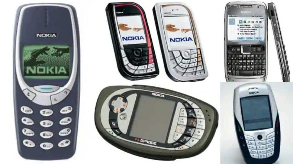
Nokia 1100 was the most popular phone of its time in India with a susbtantial market share before the advent of smartphones. It was known for its durability and sturdiness. 

6/7

Nokia's Experiment With Windows

Nokia's Experiment With Windows

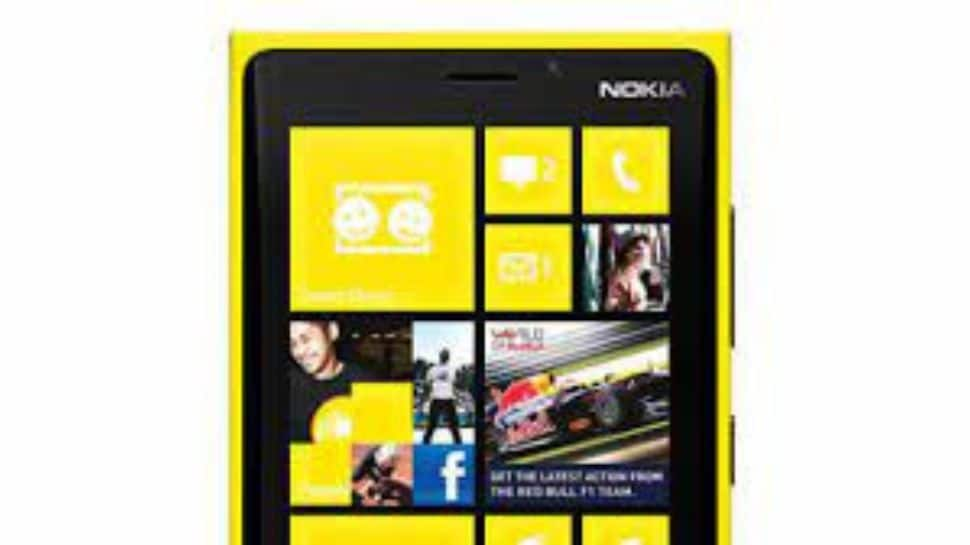
Nokia ventured onto a different path when others were heading towards Google's Android for OS on the smartphones. But the move was a failure.

7/7

Nokia's Downfall in Mobile Segment

Nokia's Downfall in Mobile Segment

Once a popular phone brand with a substantial market share, Nokia failed to compete in the market on the rise of Samsung, and other chinese brands. Its market share shrivelled continously. 

Most Popular